Python-nvd3 is a Python wrapper for NVD3 graph library. NVD3 is an attempt to build re-usable charts and chart components for d3.js without taking away the power that d3.js gives you.
Project location : https://github.com/areski/python-nvd3
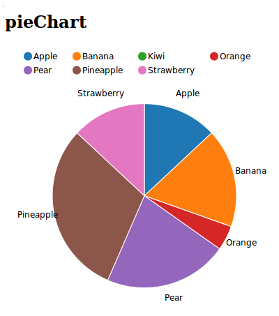
pieChart
- class nvd3.pieChart.pieChart(**kwargs)
A pie chart (or a circle graph) is a circular chart divided into sectors, illustrating numerical proportion. In chart, the arc length of each sector is proportional to the quantity it represents.
Python example:
from nvd3 import pieChart
chart = pieChart(name='pieChart', color_category='category20c', height=400, width=400)

xdata = ["Orange", "Banana", "Pear", "Kiwi", "Apple", "Strawberry", "Pineapple"]
ydata = [3, 4, 0, 1, 5, 7, 3]

extra_serie = {"tooltip": {"y_start": "", "y_end": " cal"}}
chart.add_serie(y=ydata, x=xdata, extra=extra_serie)
chart.buildhtml()
Javascript generated:
data = [{ key: "Cumulative Return",
          values: [
            {
              "label": "One",
              "value" : 29.765957771107
            },
            {
              "label": "Two",
              "value" : 0
            },
            {
              "label": "Three",
              "value" : 32.807804682612
            },
          ]
        }]

nv.addGraph(function() {
    var chart = nv.models.pieChart()
      .x(function(d) { return d.label })
      .y(function(d) { return d.value })
      .showLabels(true);

    chart.color(d3.scale.category20c().range());

    chart.tooltipContent(function(key, y, e, graph) {
        var x = String(key);
        var y =  String(y)  + ' cal';
        tooltip_str = '<center><b>'+x+'</b></center>' + y;
        return tooltip_str;
    });

    d3.select("#div_id")
        .datum(data)
        .transition()
        .duration(1200)
        .call(chart);

  return chart;
});